Example: Pie Chart
This program is an example of creating a simple pie chart:
##############################################################################
#
# An example of creating a chart with Pandas and XlsxWriter.
#
# Copyright 2013, John McNamara, jmcnamara@cpan.org
#
import pandas as pd
from vincent.colors import brews
# Some sample data to plot.
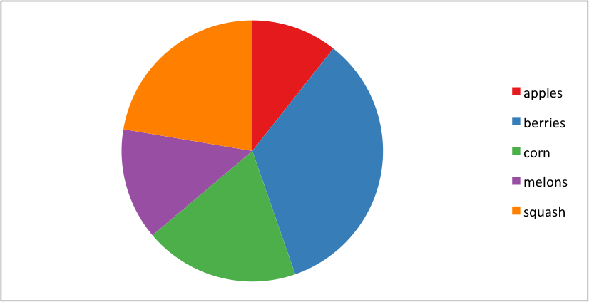
farm_1 = {'apples': 10, 'berries': 32, 'squash': 21, 'melons': 13, 'corn': 18}
# Create a Pandas dataframe from the data.
df = pd.DataFrame([farm_1], index=['Farm 1'])
# Create a Pandas Excel writer using XlsxWriter as the engine.
excel_file = 'pie.xlsx'
sheet_name = 'Sheet1'
writer = pd.ExcelWriter(excel_file, engine='xlsxwriter')
df.to_excel(writer, sheet_name=sheet_name)
# Access the XlsxWriter workbook and worksheet objects from the dataframe.
workbook = writer.book
worksheet = writer.sheets[sheet_name]
# Create a chart object.
chart = workbook.add_chart({'type': 'pie'})
# Configure the chart from the dataframe data. Configuring the segment
# colours is optional. Without the 'points' option you will get Excel's
# default colours.
chart.add_series({
'categories': '=Sheet1!B1:F1',
'values': '=Sheet1!B2:F2',
'points': [
{'fill': {'color': brews['Set1'][0]}},
{'fill': {'color': brews['Set1'][1]}},
{'fill': {'color': brews['Set1'][2]}},
{'fill': {'color': brews['Set1'][3]}},
{'fill': {'color': brews['Set1'][4]}},
],
})
# Insert the chart into the worksheet.
worksheet.insert_chart('B4', chart)
# Close the Pandas Excel writer and output the Excel file.
writer.save()